Challenge
What did the project really need?
The challenge was to make a straightforward product feel premium without clutter, while keeping purity and credibility visible from the first screen.
Project case study
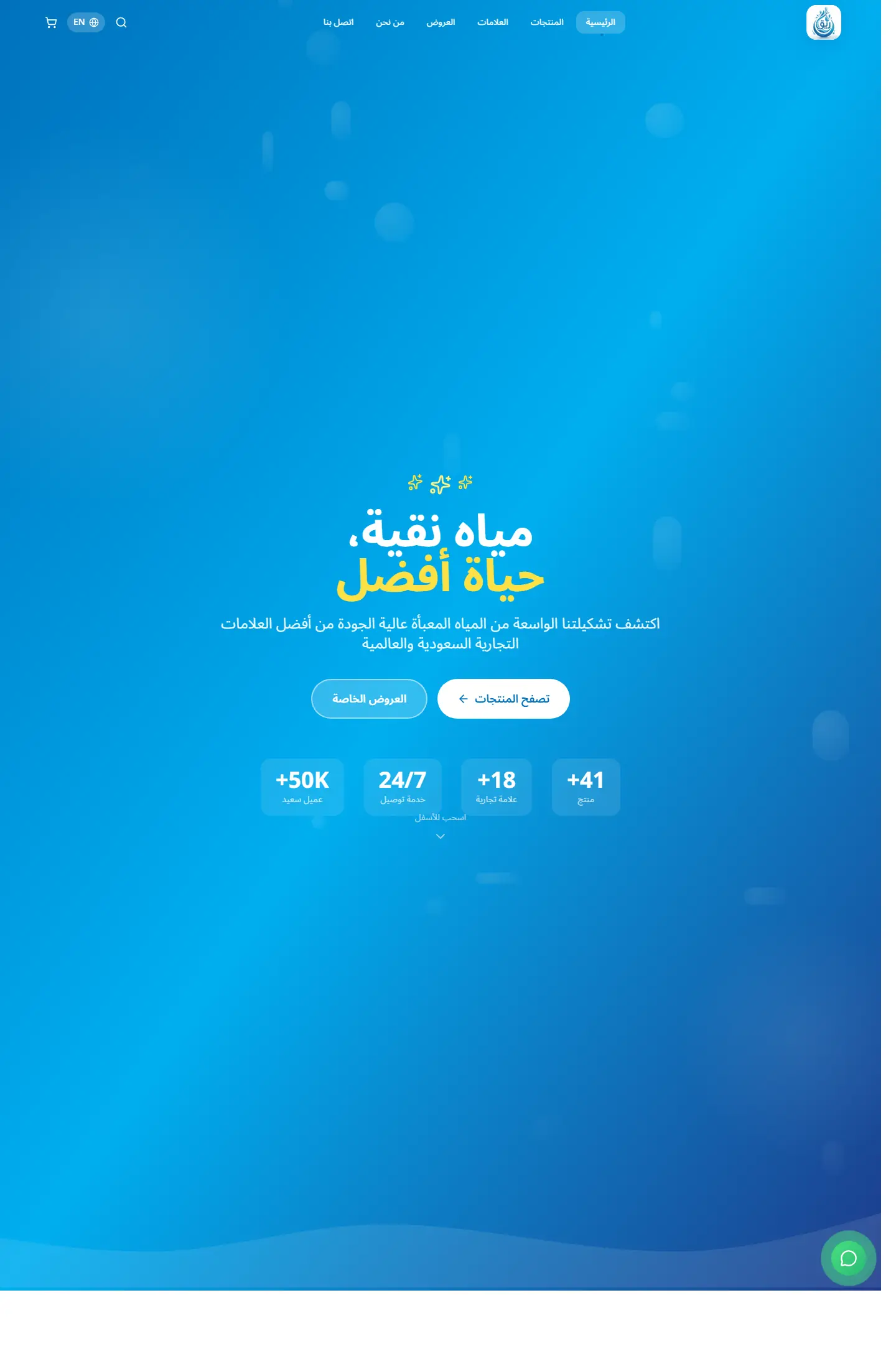
Reeq presents a premium water brand through a calm and structured storefront that balances product benefits, trust signals, and a clean consumer-facing presentation.
A clean brand-led storefront for a premium water label, focused on trust, product clarity, and health-oriented messaging.
Project type
Brand storefront / product shop
Audience
Consumer brands and customers looking for clear product presentation
Role
Shaping the product presentation and building a lightweight storefront
Challenge
The challenge was to make a straightforward product feel premium without clutter, while keeping purity and credibility visible from the first screen.
Approach
The experience leans on wide spacing, calming blue gradients, short-value messaging, and direct calls to action that move users toward the product catalog quickly.
Outcome
The result feels like a scalable brand storefront and gives the portfolio a strong consumer-product example with a confident visual identity.
Focus
Product trust
Brand clarity
Clean conversion path
Tech stack
Deliverables
Experience highlights
تدرجات هادئة
قراءة مريحة
وضوح للرسالة
حضور بصري نظيف
Project snapshots
Related work
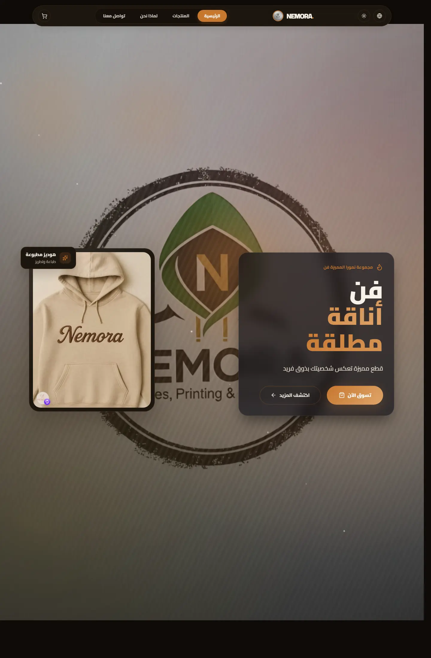
متجر رقمي لبراند ملابس مطبوعة يركز على إبراز الهوية، وضوح المنتج، وصناعة واجهة بيع تبدو حديثة ومريحة.
Focus
Brand presence / Product clarity / Conversion flow
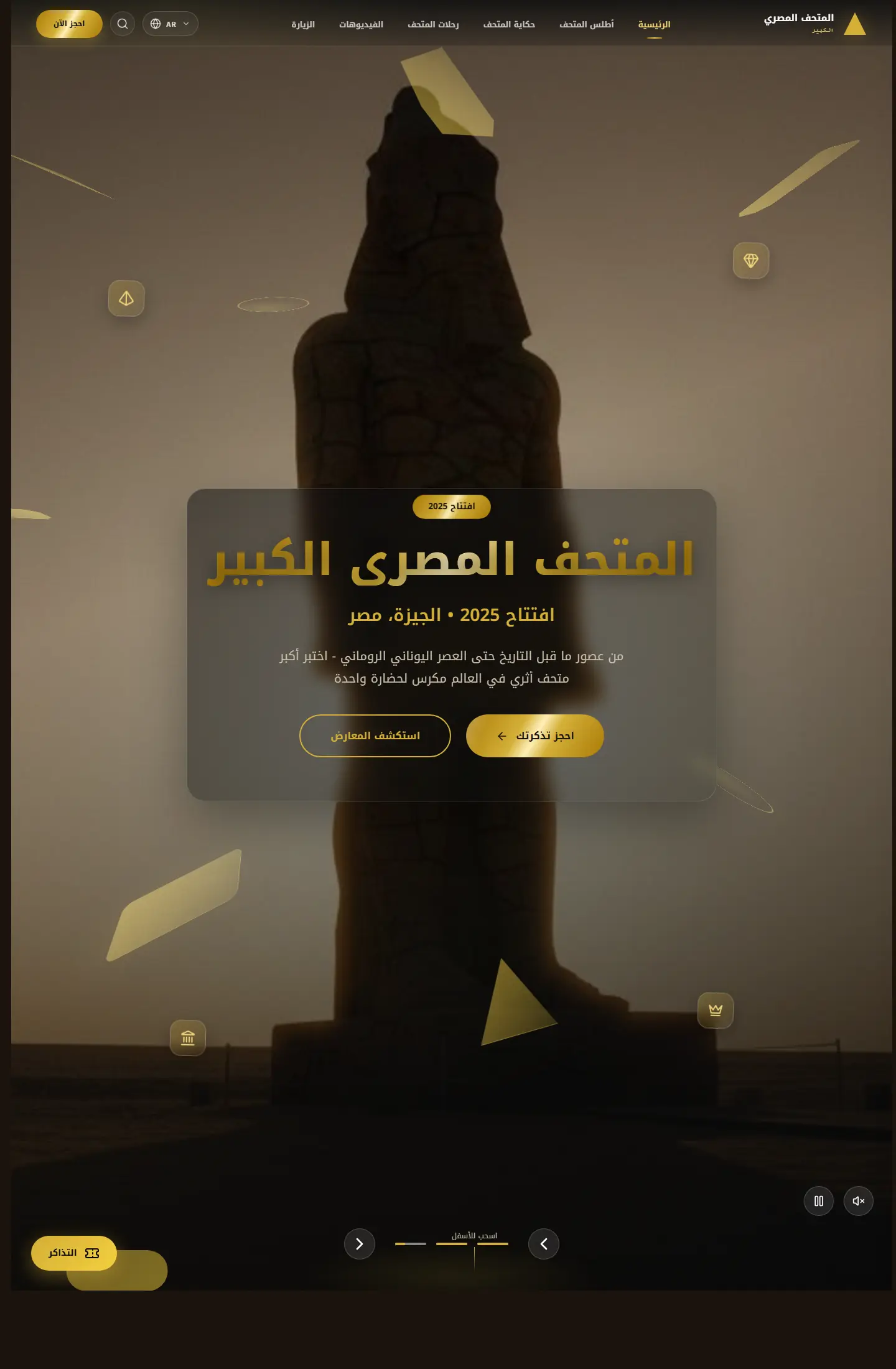
موقع ثقافي يقدّم تجربة عرض متحفية رقمية تمزج بين المعلومة، الإبهار البصري، وروح الاكتشاف.
Focus
Institutional feel / Immersive imagery / Cultural framing
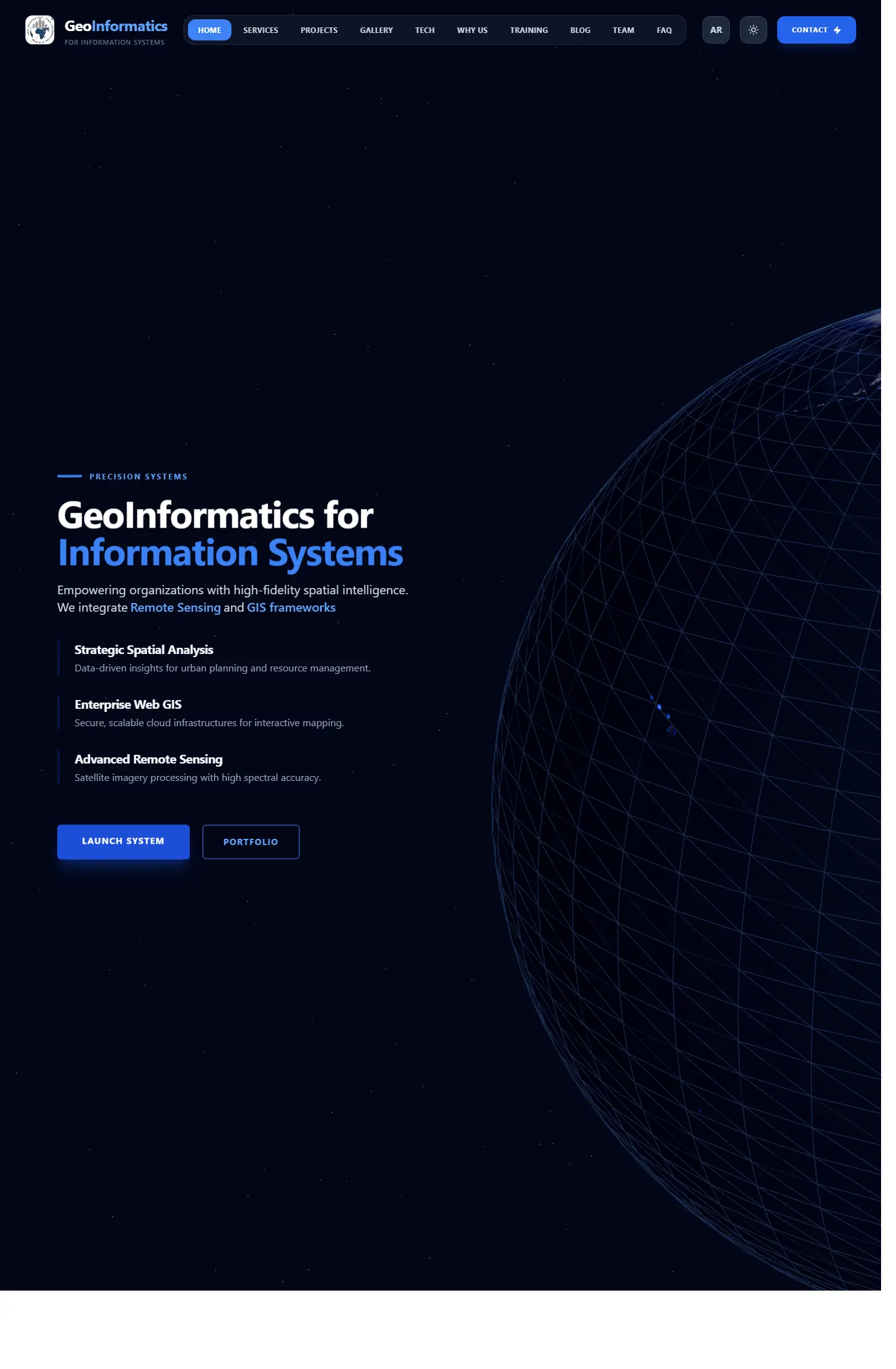
واجهة شركة تعمل في نظم المعلومات الجغرافية والاستشعار عن بعد، مع تركيز واضح على الخبرة والخدمات التقنية.
Focus
Technical clarity / Service packaging / Professional trust